

Good Website Design Starts Long Before the First Click

We all love a beautiful website. I certainly do. Good typography, beautiful imagery, a clever layout and all those little details that make you go, “Oh, that's nice.” But just because a website looks beautiful doesn't necessarily mean it's a good website.
At JP Mediaworks, we've worked with all sorts of businesses over the years. Property development, hospitality, healthcare, sports and recreation, professional services. You name it. And if there's one thing we've learnt, it's that no two businesses are quite the same.
They all have their own way of doing things, their own customers and their own stories to tell. So what works beautifully for one business might not make much sense for another.
That's why we spend time getting to know the business before jumping into the design.
What do they do?
Who are they trying to reach?
What are their customers looking for?
And most importantly, what do they actually need their website to do?
It might sound like pretty basic stuff, but you'd be surprised how much these conversations can shape the whole direction of a website.
And that's really where good website design begins. Not with picking colours or fonts, but with understanding the business, the people behind it and how everything needs to work together.
Before the Design, There's the Brand Journey
A good website doesn't start with a layout. It starts with understanding the brand and the people visiting it. Before we get carried away with colours, fonts and beautiful imagery (the fun stuff!), there's quite a bit of thinking to do.
Take a property developer, for example. Some visitors might be exploring new developments, while others simply want to know more about the company. Different people, different needs.
That's why we plan the customer journey before jumping into design. We want to make sure people can find what they're looking for without having to think too hard about it.
Then comes wireframing. Think of it as putting a puzzle together. We're figuring out what goes where and asking ourselves:
What should visitors see first?
What information should follow?
Where should we introduce a call-to-action?
And are we making people work too hard to find something?
It's not the prettiest stage. Mostly boxes, text and a lot of moving things around. But trust me, it's much easier to rearrange a few boxes than redesign an entire website later!
For us, it all goes hand in hand. The brand gives us the story, the wireframe helps us organise it, and the design brings it to life.
Looking Good Is Only Half the Job
As designers, it's very easy to get excited about the visual side of things.
We love exploring layouts, trying different typography, finding the right imagery and occasionally getting carried away with an interesting animation. It's part of the fun.
But somewhere along the way, we also have to ask ourselves whether all of it is actually necessary.
Does it help the visitor understand the business?
Is the information easy to find?
Does the website feel comfortable to navigate?
Or are we just making things look pretty?
There's nothing wrong with making something beautiful. We wouldn't be doing what we do if we didn't care about aesthetics. But the design needs to work too. Sometimes the answer is a bold, visually engaging website. Other times, something much simpler does the job beautifully. And I think that's one of the things experience teaches you. Not everything needs to be complicated to be good.
Same Design Process, Very Different Businesses
One of the things I enjoy most about our work is getting to know different businesses. We're often learning about industries we knew very little about before meeting the client. How they operate, what their customers care about, the challenges they face and the things that make their business different. It's actually one of the more interesting parts of being in this industry. And when it comes to websites, those conversations matter.
I've got two projects that come to mind are Daiman Group and Sage Clinic. Both needed a professional website. Both needed to communicate credibility. But beyond that, the similarities pretty much ended.
Daiman Group: Bringing Everything Together
Daiman is a name that's been around in Johor for generations. With businesses spanning property development, hospitality, sports and recreation, there's quite a lot to bring together under one website. And that was one of the main considerations when approaching the design. Each business has its own identity and purpose. Someone browsing a property development is looking for something completely different from someone checking out the facilities at a sports complex. Yet everything still needs to feel like it belongs to Daiman Group. This is where understanding the brand journey and planning the wireframe became particularly important.

We needed to consider how visitors would move between the different business divisions, what information mattered most to each audience and how to organise everything without making the website feel overwhelming. Of course, the visual presentation matters.
Property developments deserve beautiful imagery and space to showcase their architecture.

Sports and recreation pages, on the other hand, need to be more practical, with information that's easy to access.
It's really about understanding what people are there for.
And with a business as established and diverse as Daiman, the website also needs to reflect the reputation they've built over the years. Sometimes the challenge isn't designing something new. It's finding a better way to present everything that's already there.
Sage Clinic: A Completely Different Conversation
Then there's Sage Clinic, an Australian telehealth psychiatry practice. This was a project where we worked on both the brand identity and website, which gave us the opportunity to think about the experience as a whole. And naturally, the approach was very different.
When someone visits a psychiatry website, they may be looking for help, trying to understand an assessment process or simply finding out whether a particular service is right for them or their family.

So we had to be mindful of how the website would make people feel. We wanted Sage to be contemporary and professional, but not cold or overly clinical. Something welcoming, without losing the credibility you'd expect from a specialist healthcare practice. The brand journey helped us think about the questions visitors might have, the reassurance they may be looking for and how to guide them towards the right information. That thinking carried through to the wireframe, where we considered how to organise services, assessments, fees and referrals in a way that felt clear and approachable. The typography, colours, spacing and way information was presented all played a part in that.
Even the smallest design decisions can change the way a website feels.
Too much information can be overwhelming.
Too little can leave people with unanswered questions.
It's about finding that comfortable middle ground.
And I think Sage is a lovely example of how branding and website design can work together when they're considered from the beginning.
Two very different clients, with very different needs. And that's exactly why we don't believe every website should be approached in the same way.
Do Businesses Still Need Professional Website Designers in 2026?
This is an interesting one. Especially now, when you can build a website using a template, drag-and-drop editor or AI tool in a matter of hours. And to be fair, some of these tools are really good. We've always believed that technology should make our work easier, not something we need to compete against.
For a small business just starting out, a ready-made website might be perfectly suitable. Not everyone needs a fully customised digital experience from day one. But I do think there's a difference between knowing how to put a website together and knowing how to design one for a business. You can have access to all the right tools and still not know what to do with them. It's a kind of like having a good camera. It doesn't automatically make you a good photographer.
A template can give you a layout. AI can generate copy and images. But someone still needs to understand the brand, make sense of the information and decide how everything should come together.
What should people see first?
What do we want them to understand?
Are we making things unnecessarily complicated?
These are the decisions that take thought.
And that's really where I see the value of professional design. Not simply in making something look more expensive or impressive, but in knowing why certain decisions are being made.
Not Everything Needs to Move
We love technology. And we're always exploring new tools, design techniques and ways of making digital experiences more interesting. But sometimes I look at a website and think, does everything really need to move?
Animations can be beautiful. Interactive features can be clever. But if they're slowing down the website or making it difficult for someone to find what they're looking for, then perhaps we've missed the point.
The same goes for overly complicated navigation or layouts that look amazing on a desktop but become a nightmare on mobile. You just want to find a phone number or read about a service, but you're busy scrolling through animations and trying to work out where everything is. I think there's a lot to be said for simplicity. Good spacing. Clear typography. Easy navigation. Information presented in a way that makes sense.
They might not be the most exciting things to talk about, but they make such a difference to the overall experience. And quite often, getting those little details right takes more thought than adding another fancy feature.
Your Website Should Feel Like Your Business
I cannot stress this enough. Branding doesn't stop at the logo. It's everything people see, read and experience when they interact with your business. Your website, social media, packaging, signage, brochures, even the way you communicate with customers.
They should all feel connected.
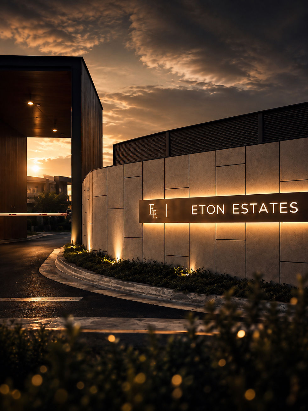
Working with businesses on everything from their brand identity right through to the signage on their buildings. It's always nice seeing it all come together. And the website should fit into that too. It shouldn't feel like something separate, or be the thing that decides how the brand looks. It should simply reflect the brand we've worked so hard to build.
That's why we prefer to understand the bigger picture before getting too caught up in individual design elements. With Sage Clinic, for example, developing the brand identity alongside the website meant we could carry the same design thinking through both. The result feels more considered because everything was designed to belong together. And that's what good branding should do. It should feel familiar and consistent, no matter where someone comes across your business.
Good Design Should Have Room to Grow
A website isn't something you design once and forget about. Businesses grow, services change and sometimes things take a completely different direction. That's why we always think about how a website can grow with the business. It should be easy to update, flexible enough for new content and still make sense a few years down the road.
And while we love exploring new design trends, not every trend is worth following. Some look great today but don't age particularly well. I'd much rather create something that suits the business and stands the test of time than something that looks trendy for six months.
At the End of the Day...
Good design isn't always about doing more. Sometimes it's about knowing what to leave out.
It's about understanding the business, asking the right questions and finding the best way to bring everything together.
And that's what we enjoy about what we do. Every project is different, and there's always something new to explore, a challenge to solve or a better way of doing things. Of course, we love creating beautiful websites. But what's more satisfying is knowing that what we've designed makes sense for the business, reflects its personality and does what it's meant to do.
Good golly, that was a long one. I don't often write long form blogs but this topic really got me going, because good design shouldn't just look good. It should work just as well.
Explore our website design capabilities at JP Mediaworks, where we bring branding, creative thinking and digital experiences together.

Comments