top of page


PROJECT SUMMARY
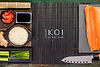
One of our favourite brands to work with was Koi, a local suburban sushi bar. A trendy and hip sushi bar, we went with contrast colours for their brand design which was inspired by koi fishes as well as their served dishes.
LOCATION
Oslo, Norway
INDUSTRY
Japanese Sushi Bar
CATEGORY
Visual Identity, Signage
KOI URBAN SUSHI BAR
The contrast elements can been appreciated across multiple sensory - from the aesthetics and decor of the bar, to the look and feel of the menu and other collaterals, and even the experience of tasting their food. All this brings together to form a uniformed brand visual that makes their brand stand out.


bottom of page